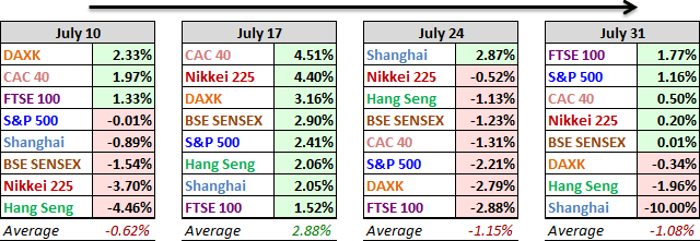
Five of the eight indexes on our world watch finished in the green this week, although India's SENSEX was up only 0.01% and Japan's Nikkei 0.20%. The UK's FTSE 100 was the top performer with a 1.77% advance. This was the first top finish for the FTSE so far this year. The Shanghai was by far the worst performance, down an even 10% for the week.
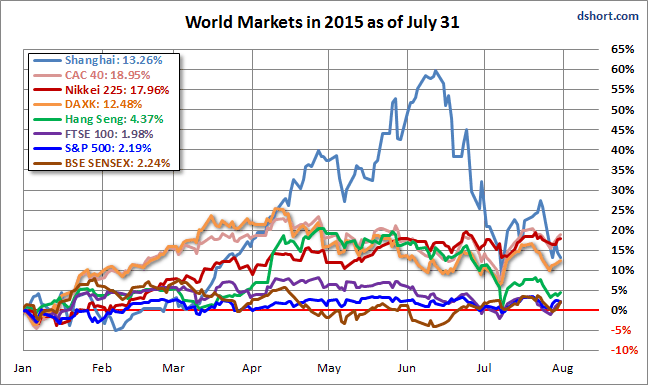
Now for some market trivia: Which index has had the distinction of the most top weekly gains to date this year? The Shanghai Composite, of course, with 15 of the 31 closes (starting with Friday, January 2nd). And which index has the dubious distinction of the most last-place weekly closes? The Shanghai nudges out the SENSEX with eight last place weekly closes against the SENSEX's seven.
Here is an overlay of the eight for a sense of their comparative performance so far in 2015.
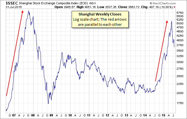
Here's an updated look at the Shanghai Composite over the past nine years. Below is a log-scale weekly chart illustrating the bubble that peaked in 2007 and the rally that started last year. The plunge from the 2015 peak was astonishingly swift and severe. The rally over the previous two weeks week had boosted hopes that the worst was over. But this week's 10% nosedive certainly disappointed the optimists.
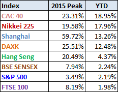
Above, a table of the 2015 data performance, sorted from high to low, along with the interim highs for the eight indexes. All eight indexes are in the green, with France's CAC 40 at the top.
A Closer Look at the Last Four Weeks
The tables below provide a concise overview of performance comparisons over the past four weeks (through year's end) for these eight major indexes. We've also included the average for each week so that we can evaluate the performance of a specific index relative to the overall mean and better understand weekly volatility. The colors for each index name help us visualize the comparative performance over time.
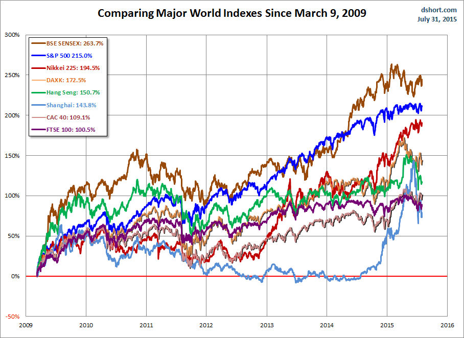
The chart below illustrates the comparative performance of World Markets since March 9, 2009. The start date is arbitrary: The S&P 500, CAC 40 and BSE SENSEX hit their lows on March 9th, the Nikkei 225 on March 10th, the DAX on March 6th, the FTSE on March 3rd, the Shanghai Composite on November 4, 2008, and the Hang Seng even earlier on October 27, 2008. However, by aligning on the same day and measuring the percent change, we get a better sense of the relative performance than if we align the lows.
A Longer Look Back
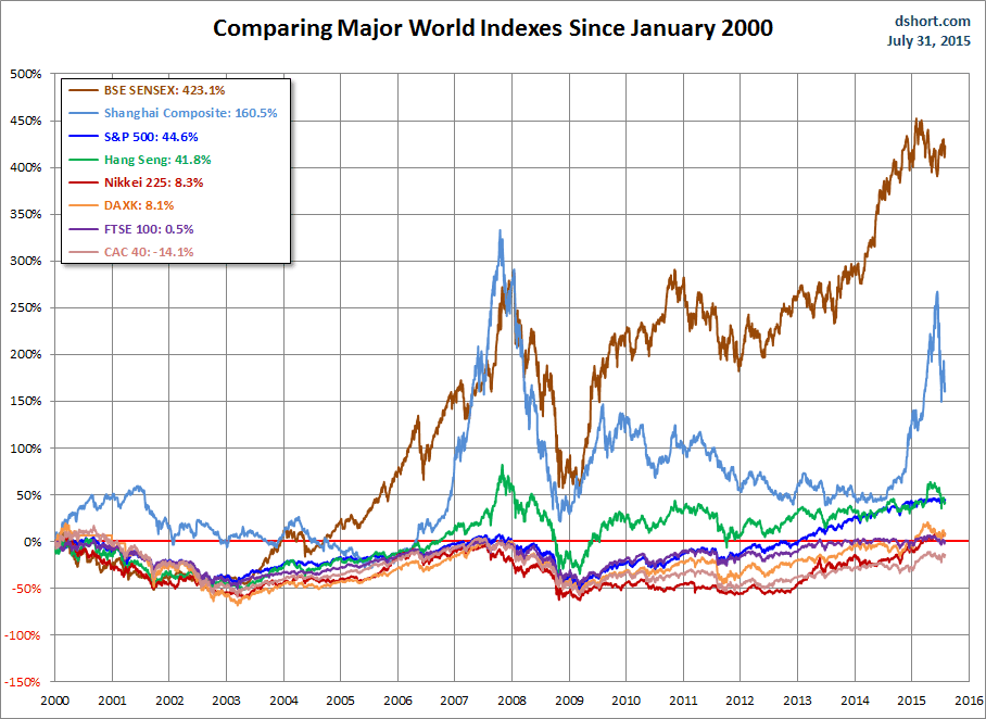
Here is the same chart starting from the turn of 21st century. The relative over-performance of the emerging markets (Shanghai, Mumbai SENSEX and Hang Seng) up to their 2007 peaks is evident, and the SENSEX remains by far the top performer. The Shanghai, in contrast, formed a perfect Eiffel Tower from late 2006 to late 2009.
Check back next week for a new update.
Note: We track Germany's DAXK a price-only index, instead of the more familiar DAX index (which includes dividends), for consistency with the other indexes, which do not include dividends.
All the indexes are calculated in their local currencies.

