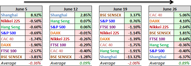
The top performers in our world market focus group over the past week were the two Eurozone indexes. France's CAC 40 rose an impressive 5.06%, and Germany's DAXK was up 4.10%, both bouncing back a bit from the European selling associated with the ongoing and rather tedious Grexit drama. But the bigger international story is the mounting evidence of the Shanghai Bubble. The benchmark Shanghai Composite dropped another 6.37%, following up on its 13.32% plunge the previous week.
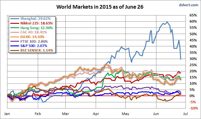
Here is an overlay of the eight for a sense of their comparative performance so far in 2015.
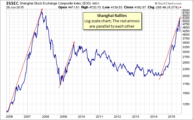
Let's take a closer look at the Shanghai over the past nine years. Below is a log-scale chart illustrating the bubble that peaked in 2007, the bounce that started in late 2008 and the rally that started last year. We've added an arrow to highlight the big bubble and then used the same angle to create the other two arrows, which confirms our hypothesis that major rallies in China have a distinct family resemblance.
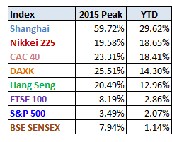
Above is a table of the 2015 data performance, sorted from high to low, along with the interim highs for the eight indexes. All eight indexes are in the green, with China's as the outlier at the top despite its two-week plunge.
A Closer Look at the Last Four Weeks
The tables below provide a concise overview of performance comparisons over the past four weeks (through year's end) for these eight major indexes. We've also included the average for each week so that we can evaluate the performance of a specific index relative to the overall mean and better understand weekly volatility. The colors for each index name help us visualize the comparative performance over time.
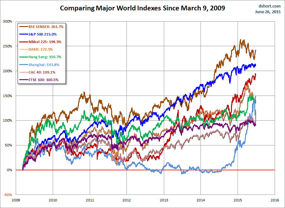
The chart below illustrates the comparative performance of World Markets since March 9, 2009. The start date is arbitrary: The S&P 500, CAC 40 and BSE SENSEX hit their lows on March 9th, the Nikkei 225 on March 10th, the DAX on March 6th, the FTSE on March 3rd, the Shanghai Composite on November 4, 2008, and the Hang Seng even earlier, on October 27, 2008. However, by aligning on the same day and measuring the percent change, we get a better sense of the relative performance than if we align the lows.
A Longer Look Back
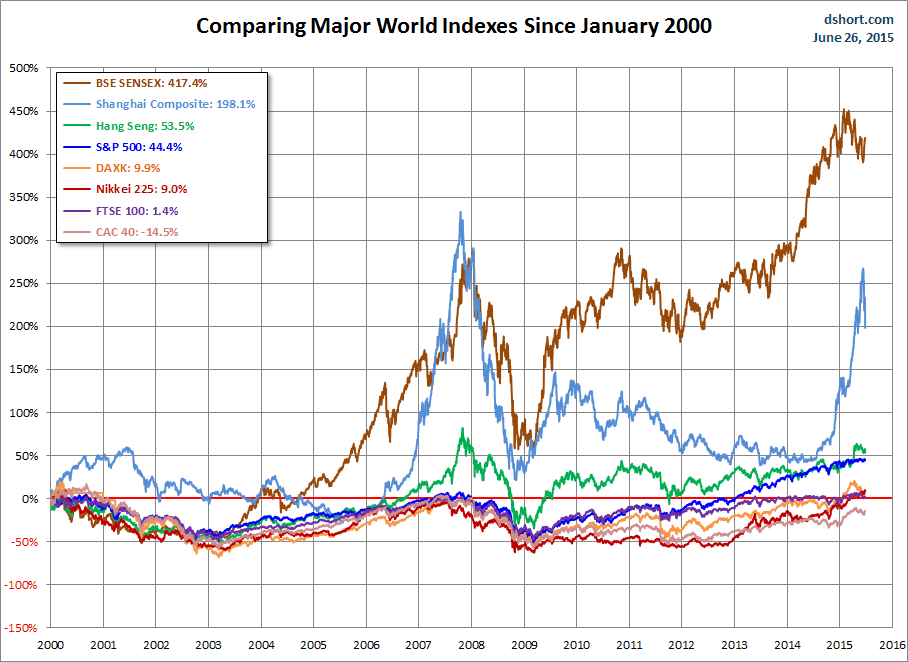
Here is the same chart starting from the turn of 21st century. The relative over-performance of the emerging markets (Shanghai, Mumbai SENSEX and Hang Seng) up to their 2007 peaks is evident, and the SENSEX remains by far the top performer. The Shanghai, in contrast, formed a perfect Eiffel Tower from late 2006 to late 2009.
Check back next week for a new update.
Note: We track Germany's DAXK a price-only index, instead of the more familiar DAX index (which includes dividends), for consistency with the other indexes, which do not include dividends.
All the indexes are calculated in their local currencies.

