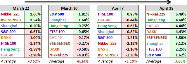
Last weekend we saw that the week-over-week average of the eight indexes on our watch list was -1.10%. But global markets are back in rally mode. Over the past five sessions that average has soared to 3.86%. You know it's been a good week when the worst performer, the S&P 500, posts a 1.62% gain. Japan's top performing Nikkei rose a whopping 6.49%.
A Closer Look at the Last Four Weeks
The tables below provide a concise overview of performance comparisons over the past four weeks for these eight major indexes. We've also included the average for each week so that we can evaluate the performance of a specific index relative to the overall mean and better understand weekly volatility. The colors for each index name help us visualize the comparative performance over time.
A Closer Look at the Year-to-Date Performance
Here is an overlay of the eight illustrating their comparative performance so far in 2016.
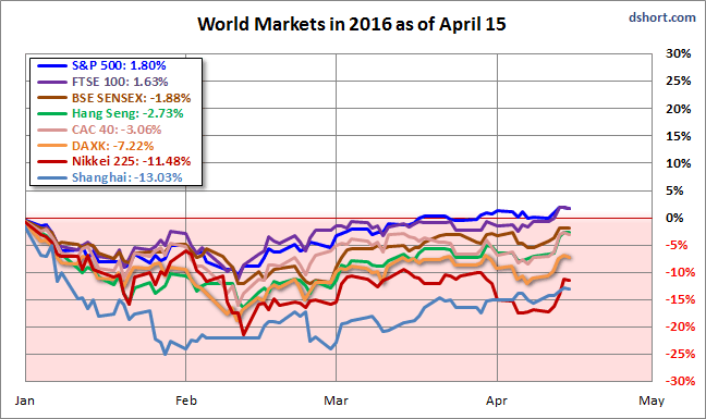
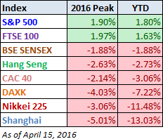
Here is a table of the 2016 performance, sorted from high to low, along with the interim highs for the eight indexes. The top performing S&P 500 has been joined in the green by the UK's FTSE 100. Thanks to its amazing weekly gain, Japan's Nikkei 225 has moved up a notch out of last place, which gives the dubious distinction of biggest loser to China's Shanghai Composite, down 13.03% year-to-date in 2016.
The Global Bear Market Perspective
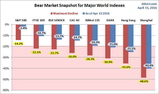
The column chart is sorted by the least to worst declines from previous peaks as of the week's end. Seven of our eight watch list indexes had dropped into bear territory (a 20% decline), the S&P 500 being the sole exception. As of the latest close, five of the eight have emerged from the bear zone, up from four the previous week.
A Longer Perspective
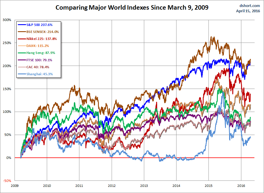
The chart below illustrates the comparative performance of World Markets since March 9, 2009. The start date is arbitrary: The S&P 500, CAC 40 and BSE SENSEX hit their lows on March 9th, the Nikkei 225 on March 10th, the DAX on March 6th, the FTSE on March 3rd, the Shanghai Composite on November 4, 2008, and the Hang Seng even earlier on October 27, 2008. However, by aligning on the same day and measuring the percent change, we get a better sense of the relative performance than if we align the lows.
A Longer Look Back
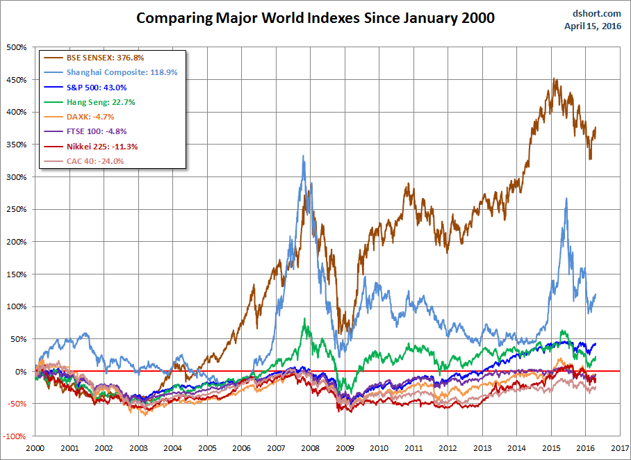
Here is the same chart starting from the turn of 21st century. The relative over-performance of the emerging markets (Shanghai, Mumbai SENSEX and Hang Seng) up to their 2007 peaks is evident, and the SENSEX remains by far the top performer. The Shanghai, in contrast, formed a perfect Eiffel Tower from late 2006 to late 2009.
Check back next week for a new update.
Note: We track Germany's DAXK a price-only index, instead of the more familiar DAX index (which includes dividends), for consistency with the other indexes, which do not include dividends.
All the indexes are calculated in their local currencies.

