In our last market update, I wrote about how market technicals were improving. That improvement has continued, and the market is displaying strength that we have not seen in over a year. Here is a rundown of the positive developments that have occurred recently:
- Market breadth continues to strengthen.
- Sentiment has shifted to a decidedly risk-on environment.
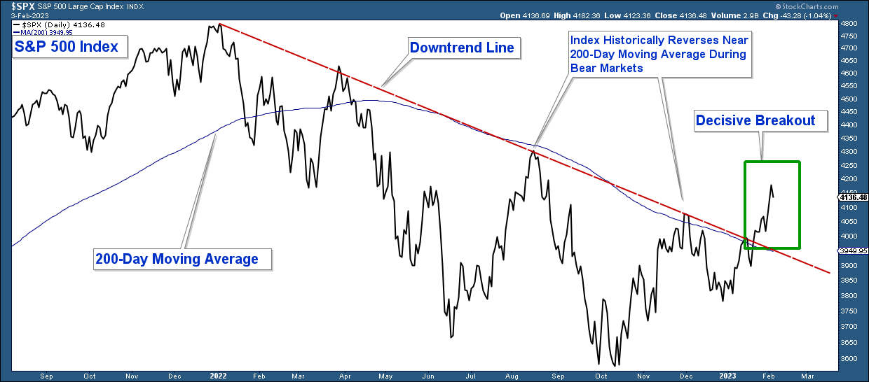
- The S&P 500 has advanced above both its downtrend line and 200-day moving average.
- The S&P 500 is now in a structural uptrend.
Stocks Likely to Advance in the Near Term
Below is an S&P 500 chart highlighting the 2022 bear market. Notice how the index has decisively advanced above both its downtrend line and 200-day moving average (notated with a green rectangle). This move coincides with ongoing market breadth improvement and a shift to a risk-on-equity market environment.
Market Breadth
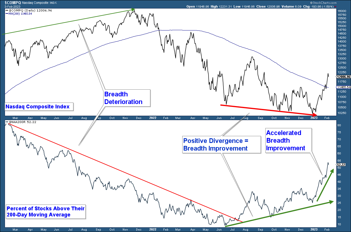
Below is a chart of the Nasdaq Composite Index in the upper panel and the percent of stocks within that index above their respective 200-day moving averages in the lower panel.
Notice the breadth deterioration that preceded the market top in January 2022. As the index was hitting new highs, the number of stocks advancing within that index declined.
We are now seeing the opposite dynamic. Market breadth has been improving as the market declined in the second half of last year.
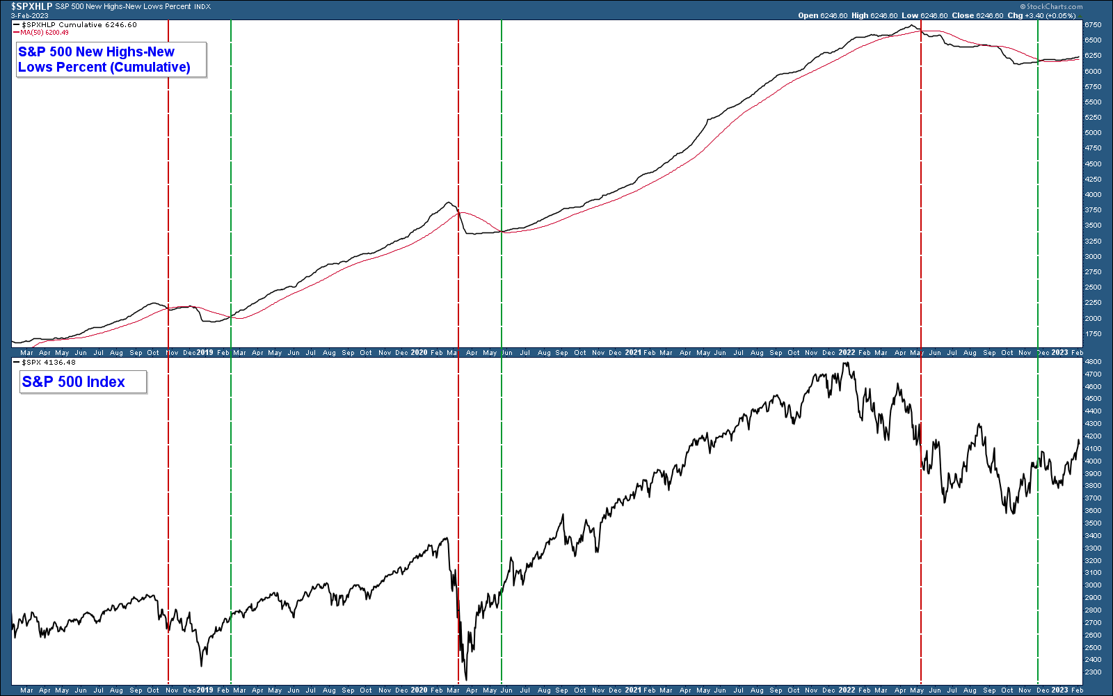
One of my favorite breadth indicators is a chart of the percent of stocks within the S&P 500 hitting new 52-week highs minus those hitting new 52-week lows. It has a tendency to lag major tops and bottoms but has been fairly accurate historically with a small number of whipsaws. Because of the lag, I frequently use this as a confirming signal. Meaning when the bulk of the data is bullish, and this indicator displays a buy signal, it confirms my bullish thesis.
A signal is generated when the indicator moves above or below its 50-day moving average. I have placed verticle lines to notate sell signals (red) and buy signals (green). The indicator went positive at the end of last year, and the bulk of the underlying technical data is now positive.
Risk-On or Risk-Off
Throughout the bear market of 2022, investors favored the relative safety of risk-off sectors, but that sentiment has materially changed.
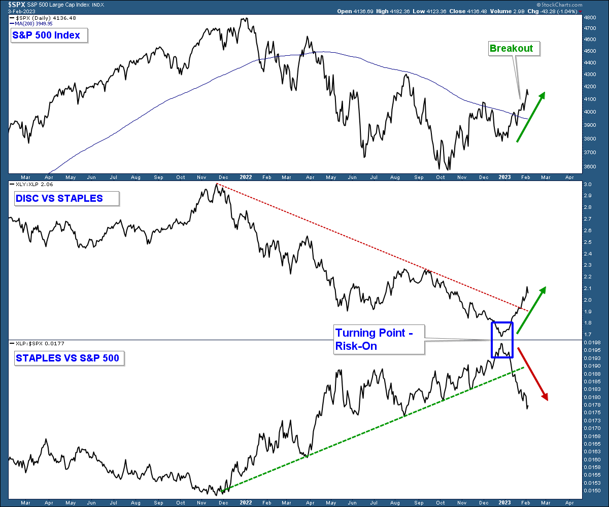
In the chart below are the S&P 500 in the upper panel and two relative strength charts in the lower panels.
The middle panel compares the strength of discretionary stocks (risk-on) relative to staples (risk-off). When the line rises, it indicates discretionary stocks are outperforming, and when it falls, staples are outperforming.
In the bottom panel I compare staples to the S&P 500 index. When the line falls, it indicates consumer staple stocks are underperforming the index.
Notice how staples outperformed last year in both charts. This results from investors being unwilling to take risks which is typical of a bear market. That dynamic has dramatically shifted. We are now seeing the opposite. The blue rectangle highlights that shift.
Discretionary stocks are outperforming staples, and staples are underperforming the market. This suggests investors are taking more risk, which is bullish for equities.
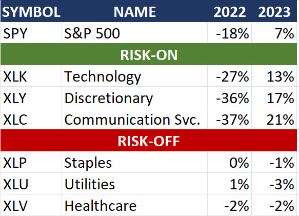
Another way to view this dynamic is by looking at the performance of risk-on sectors versus risk-off sectors during the bearish environment of 2022 compared to how they have performed year-to-date.
In 2022, risk-on sectors dramatically underperformed, while they have substantially outperformed this year.
The Economy and Longer-Term Headwinds
Recession Alert – Yield Curve Inversion
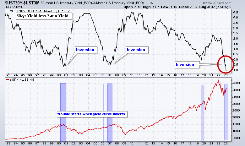
One historically accurate signal in predicting recessions is a yield curve inversion. An inversion means short-term rates are higher than longer-term rates. This does not happen often, but when it does, the odds of a recession are high.
Below is a chart of the difference between the 30-year yield less the 3-month yield in the top panel. The yields are inverted when the line drops below zero (horizontal blue line). Look at the far right of the chart. The yield is substantially inverted (red circle).
In the lower panel is the S&P 500, and I have highlighted the last three major inversions. In each case, a recession has followed, and the stock market has fallen between 33% – 55%.
There are economic reasons to be bearish equities over the long term, such as:
- Yield inversions signal an imminent recession.
- Rates are being aggressively raised by a Fed trying to combat inflation – the effects of which are only now beginning to be seen in the economy.
- Record-high fiscal debt.
In summary, the market is displaying strong bullish market technicals. This supports a bullish market thesis over the near term. Longer term,m there are headwinds that could derail this market advance. Until that happens, let’s make some hay.
