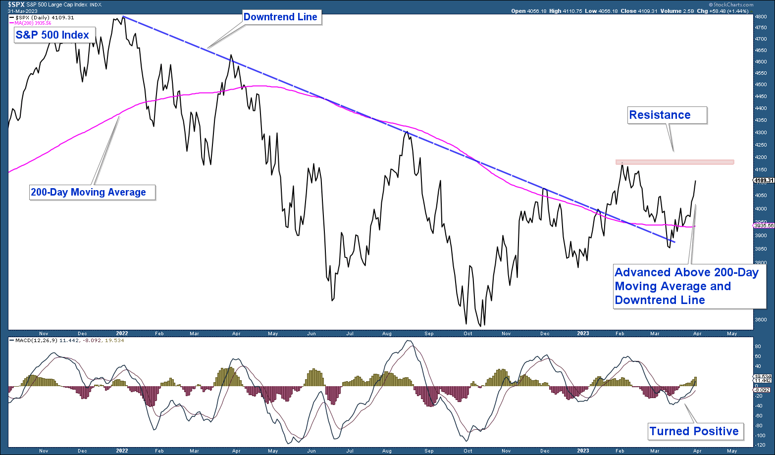
Below is a chart of the S&P 500 in the upper panel and the MACD (momentum indicator) in the lower panel. Here are my takeaways.
- Momentum has turned positive.
- The S&P 500 Index has advanced strongly above its 200-day moving average after briefly falling below it last month. During past bear markets, this moving average has been a strong area of resistance thus a move above it is decisively bullish.
- The S&P 500 is still in a structural uptrend, given it didn’t fall below December 2022 lows.
Price action is bullish as long as the S&P 500 is above its 200-day moving average.
S&P 500 Weekly Chart
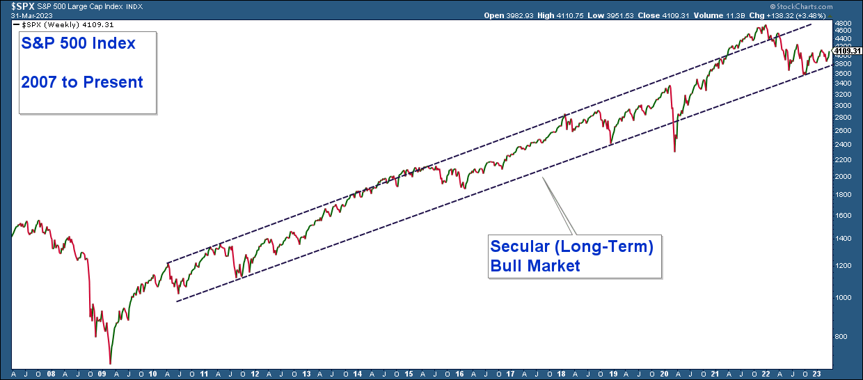
Below is a chart of the S&P 500 going back to 2007. Here are my takeaways.
- I have drawn a channel around the price action going back to 2010. Price is currently still within this channel, and thus the market is still in a secular (long-term) bull market.
- Historically when the price has reached the lower end of the channel, it has advanced strongly.
- Price is sitting at the lower end of the channel; thus, if we are still in a secular bull market, I would expect the index to advance strongly here.
- If the price drops below the channel's lower end, it would signal that we may be entering a secular bear market environment.
Despite last year’s correction, the stock market is still in a secular (long-term) bull market.
Long-Term Market Breadth
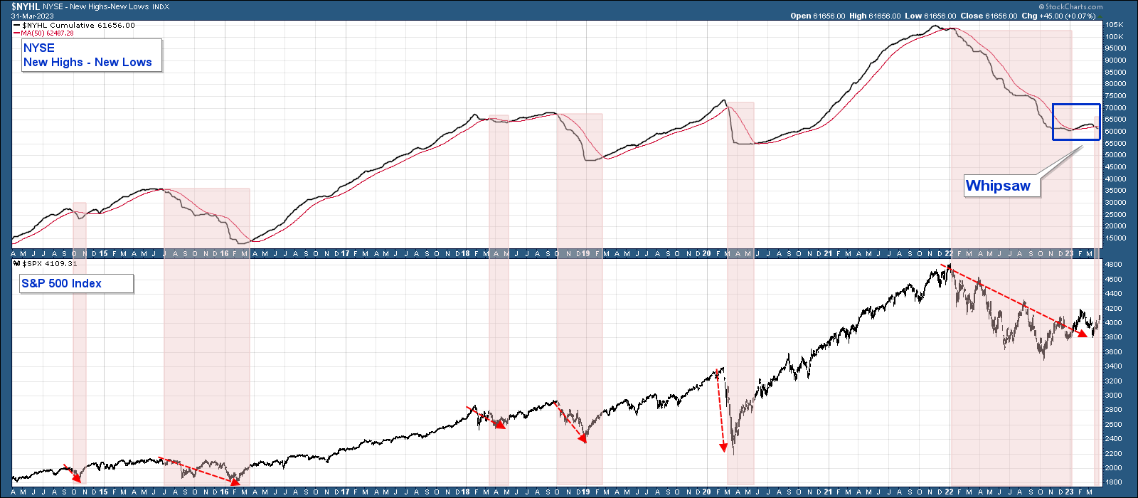
Below is a chart of the NYSE New Highs Minus New Lows in the upper panel and the S&P 500 Index in the lower panel.
This breadth indicator subtracts new lows from new highs. “New lows” is the number of stocks recording new 52-week lows. “New highs” is the number of stocks making new 52-week highs.
This indicator is a reliable long-term measure of market breadth, albeit with a small number of historical whipsaws and lags in providing signals. A move above its 50-day moving average is a bullish signal, and below a bearish one. Here are my takeaways.
- Historically each time the indicator fell below its moving average (notated in red highlights), the S&P 500 was weak.
- The indicator gave a timely sell signal at the beginning of 2022 and stayed below its moving average for the entire year.
- The indicator advanced above its moving average at the beginning of this year, signaling a buy signal. That signal failed when the indicator fell back below its moving average, forming what looks like a whipsaw or false signal.
Long-term market breadth looks weak.
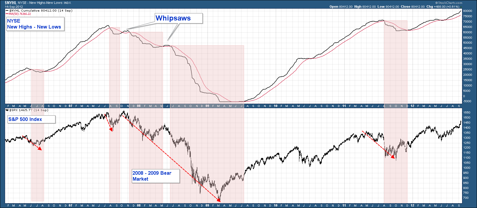
Now let’s look at that same breadth indicator but during the last major bear market in 2008 – 2009. Notice how the indicator did a fairly good job of signaling market strength and weakness, albeit with a lag.
There were two whipsaws during that bear market which, in hindsight, proved to be false signals.
The whipsaw this year looks eerily similar to the one in the last major bear market.
Sector Strength/Weakness
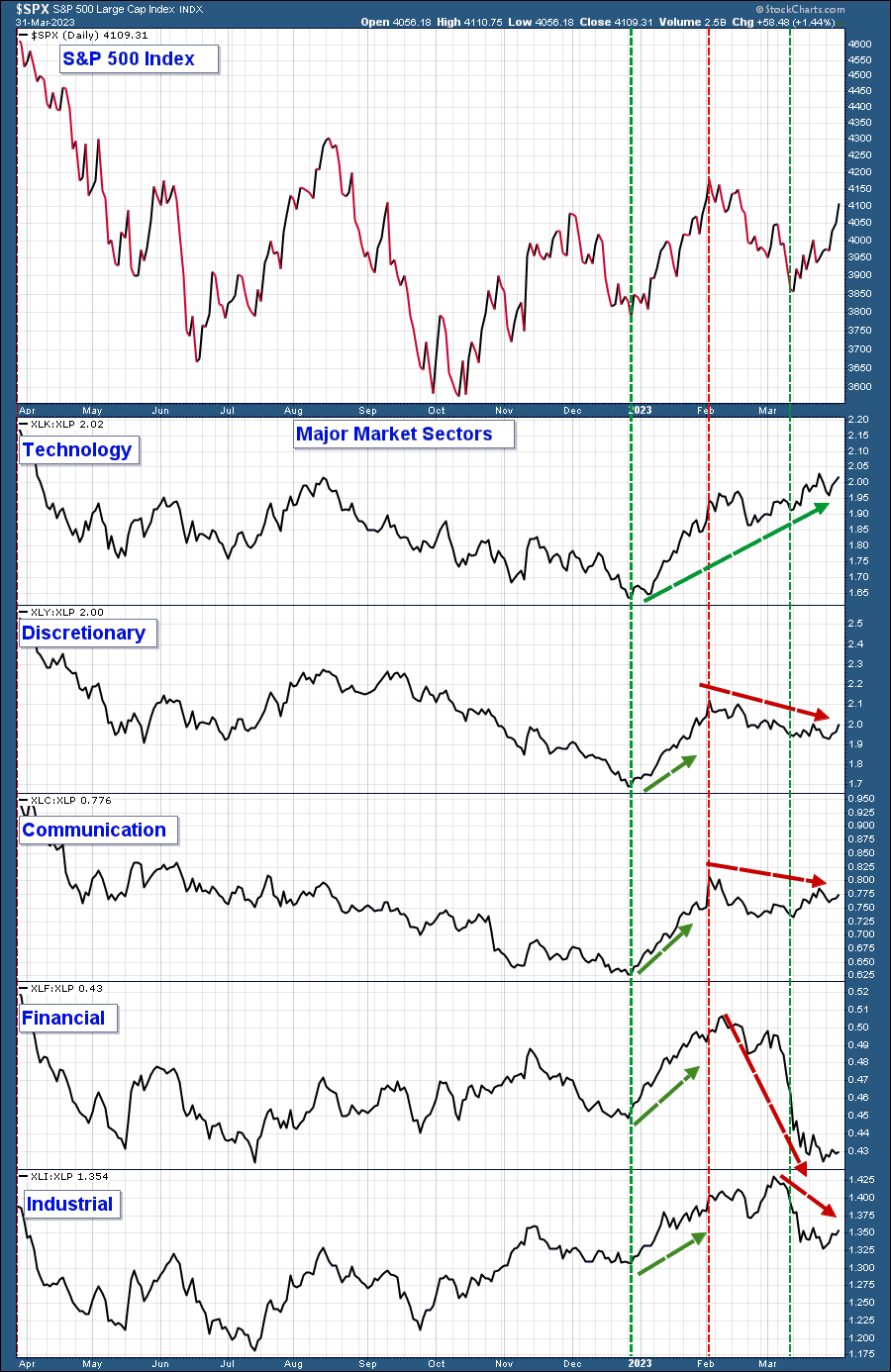
Below is a chart of the S&P 500 in the upper panel and the relative strength of major market sectors in the lower panels.
I have charted the relative strength of each of these sectors relative to Consumer Staples (NYSE:XLP). I chose XLP because it is a sector that typically does relatively well during poor market environments as investors look to reduce portfolio risk. I have notated recent S&P 500 short-term bottoms and tops with vertical red and green lines for reference. Here are my takeaways.
- In our February Market update, I noted how these sectors had begun to outperform, indicating a more bullish, risk-on market environment. See how their relative strength line advanced starting at the beginning of the year into the market’s early February peak (red verticle line).
- All sectors except Technology reversed course and began trending lower at the February peak.
We are not seeing broad-based relative strength in major market sectors. The lone exception is technology.
Risk-On Vs. Risk-Off
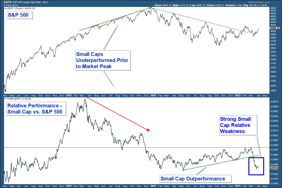
During periods of market strength, you generally see riskier assets, such as small-cap stocks, outperform.
Below is a relative strength chart in the lower panel where I compare the performance of small-cap stocks to the S&P 500 index. When the line rises, it indicates that small caps are outperforming (risk-on), and when it falls, small caps are underperforming (risk-off). Here are my takeaways.
Small caps underperformed for months prior to the January 2022 market peak. This weakness signaled internal weakness, which preceded the market’s eventual strong move lower.
Small caps started to outperform in the summer of 2022, suggesting the market was taking a more risk-on environment before the market’s October 2022 market bottom. In addition, this strength preceded a breakout in the S&P 500 above its downtrend line and 200-day moving average (not charted).
Small cap relative strength has fallen decisively below its uptrend (green) line.
Small-cap underperformance suggests a bearish risk-off environment.
Conclusion
As long as the S&P 500 continues to trade above its 200-day moving average, market conditions are favorable from a price perspective. However, given that most market internals have turned decidedly negative, I don’t place a lot of confidence in the market’s ability to continue to trade above this average for an extended period unless internals somehow improve.
