- All Instrument Types
- Indices
- Equities
- ETFs
- Funds
- Commodities
- Currencies
- Crypto
- Bonds
- Certificates
Please try another search

Weekly, Monthly Bearish Engulfing Candles Appear On DXY But How Grizzly Are They?

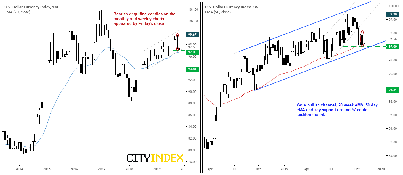
The USD index (DXY) presented traders with a bearish engulfing candle on both the weekly and monthly charts by Friday’s close. So, will this bearish pattern live up to its grizzly name in the weeks ahead?
As of Friday, it was DXY’s most bearish close since January 2018. Yet key support around 97 previously highlighted has continued to hold, and bulls managed a minor rally from this level yesterday. We doubt it will be easy for bears to break 97 easily and, even if they do, there’s also the 20-week EMA and lower trendline to contend with. But, for today, we’ll see just how bearish a bearish engulfing candle is. Using Reuters data from 1986, here’s how bearish engulfing candles have played out in the following months and weeks.
- The first thing to note here is the small sample size; being below 30, it’s not considered to be large enough to be statistically significant (so we can be less confidence in the results).
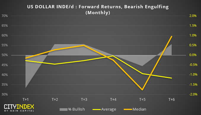
- Still, it’s interesting to note that the month following an engulfing candle has been bearish over 50% of the time, with T+5 months being the most bearish. If this were to be repeated, then March could be a bear-fest for USD. And worth noting that over the past 15 years, DXY has produced negative returns on average.
- Beyond these points, it’s hard to build a compelling bearish case from this chart as median and average returns diverge, and T+2, T+3, and T+6 produced bullish candles over 50% of the time.
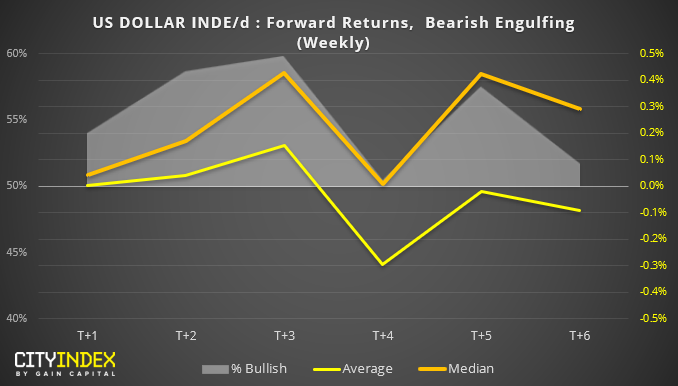
- Sample size: 87
- Well, that doesn’t look particularly bearish to me. In fact, the only negative return is T+4 average, whereas T+4 median is ‘typically’ flat
- Average and median returns become increasingly bullish between T+1 to T+3, and all produce bullish candles over 50% of the time.
- T+3 produces bullish candles nearly 60% of the time
- Average returns are negative between T+4 and T+6, whilst median (typically) returns are positive over T+1 to T+6
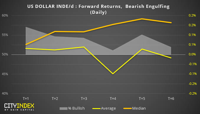
Whilst we’re here, we may as well include the results for the daily chart too. Yet the results appear similar to the weekly data; bearish engulfing candles on the daily are typically bullish over 50% of the time between T+1 to T+6.
From the data above, it doesn’t appear that bearish engulfing candles on DXY have been favorable to bears on the weekly and daily charts. Given the key level of support nearby and the fact that most of my Twitter feed is now bearish on the USD, the contrarian within me wonders if there may be further upside on the dollar over the coming week/s.
"Disclaimer: The information and opinions in this report are for general information use only and are not intended as an offer or solicitation with respect to the purchase or sale of any currency or CFD contract. All opinions and information contained in this report are subject to change without notice. This report has been prepared without regard to the specific investment objectives, financial situation, and needs of any particular recipient.
Any references to historical price movements or levels are informational based on our analysis, and we do not represent or warrant that any such movements or levels are likely to reoccur in the future. While the information contained herein was obtained from sources believed to be reliable, the author does not guarantee its accuracy or completeness, nor does the author assume any liability for any direct, indirect or consequential loss that may result from the reliance by any person upon any such information or opinions."
Related Articles

Lately, volatility has been off the charts. We’re seeing triple-digit swings in stocks, and the market is getting a real taste of the wild ride that comes with a president who...

1. S&P 500 Likely to Hold at 200-Day MA (1) Will S&P 500 indexes find support at their 200-day moving averages? We think so. Sentiment is quite bearish and the next batch...

Stocks finished the day higher, rising about 1.1%. It didn’t take much—just word that President Trump would delay auto tariffs by a month. But in a negative gamma environment,...
Are you sure you want to block %USER_NAME%?
By doing so, you and %USER_NAME% will not be able to see any of each other's Investing.com's posts.
%USER_NAME% was successfully added to your Block List
Since you’ve just unblocked this person, you must wait 48 hours before renewing the block.
I feel that this comment is:
Thank You!
Your report has been sent to our moderators for review


Add a Comment
We encourage you to use comments to engage with users, share your perspective and ask questions of authors and each other. However, in order to maintain the high level of discourse we’ve all come to value and expect, please keep the following criteria in mind:
Perpetrators of spam or abuse will be deleted from the site and prohibited from future registration at Investing.com’s discretion.